App UI Patterns That Improve Conversion
The app ui patterns that improve conversion are the ones that reduce decision effort: clear navigation, obvious primary actions, short forms, guided onboarding, helpful empty states, and timely feedback. Use patterns as proven interaction solutions, then validate them against your users, platform guidelines, accessibility needs, and product metrics.
> App UI patterns are reusable screen layouts and interaction behaviors that solve common app problems such as navigation, input, feedback, discovery, onboarding, and task completion.
- Conversion-focused app UI patterns make the next action obvious, reduce form friction, and help users recover from errors.
- Good patterns are not just visual templates; they include behavior, states, timing, accessibility, and analytics events.
- The safest pattern choices align with iOS and Android conventions, user mental models, and measurable activation or retention goals.
App UI patterns at a glance
App UI patterns are reusable layout and interaction solutions, not decorative inspiration boards. They help teams solve repeated app problems without forcing users to learn a new control system on every screen.
The conversion-related groups are navigation, onboarding, forms, calls to action, feedback, empty states, and permissions. A bottom tab bar, for example, tells users where the main destinations live. An inline form error tells them what to fix before they abandon sign-up.
Familiar beats clever here.
Predictable patterns reduce relearning, especially when someone is using one thumb on a bus or checking a task between meetings. But copying a popular app can fail when the goal, risk level, or workflow differs. A social feed pattern may feel casual in a community app and reckless in a banking transfer flow.
Five facts about app UI patterns and conversion
- App UI patterns are recurring solutions to common interface problems, so they help teams ship faster without inventing every screen from scratch.
- Pattern categories include navigation, content, input, feedback, onboarding, and settings, each tied to a different user task.
- Patterns must match platform guidelines, accessibility expectations, and user mental models, not just the latest product screenshot.
- Too many simultaneous patterns increase cognitive load on small mobile screens, especially when tabs, drawers, sheets, and hidden gestures compete.
- Input and navigation patterns can affect conversion, task success, reviews, and retention because they control how quickly users reach value.
In practice, these facts show up during ordinary release work. A Play Console pre-launch report screenshot with red accessibility and crash markers can turn a “nice pattern refresh” into a submission checklist problem. Good independent guides on mobile app product, growth, app store discovery, shipping, and industry trends deliver policy-aware decisions, not agency jargon or ranking myths.
Before you start choosing app UI patterns
Before choosing app UI patterns, gather the evidence that tells you what the screen must accomplish and what it must not break. The right inputs keep pattern selection from becoming a taste debate during sprint review.
- Define the conversion event. Name the exact action you want, such as trial start, booking, upload, or purchase, and identify the screen where that decision happens.
- List the constraints. Check iOS, Android, accessibility, and store policy requirements before a pattern reaches design approval, especially for permissions, payments, account creation, and data collection.
- Collect the baseline. Record current completion rate, error frequency, drop-off by step, time to task, and any support complaints tied to the flow.
- Identify audience limits. Note device sizes, network conditions, language needs, assistive technology use, and any context that changes how much attention the user can spare.
- Decide what needs testing. Send risky choices, custom gestures, dense forms, and trust-heavy prompts through usability testing before release, not after reviews expose the problem.
How app UI patterns work in user behavior
App UI patterns work because people recognize familiar structures before they read every label. Recognition, affordances, feedback loops, and reduced cognitive load make an app feel understandable faster.
A layout is only half the pattern. The behavior matters too: loading, error, success, disabled, and empty states all teach users what happened after a tap. A gray disabled button without a reason creates hesitation. A short success message after saving settings closes the loop.
The tap needs an answer.
Platform conventions also shape expectations. iOS users expect certain navigation bars, gestures, and permission flows; Android users bring expectations from Material Design, system back behavior, and bottom navigation. For primary references, compare pattern choices against Apple’s Human Interface Guidelines (Apple Developer documentation) and Material Design guidance for Android and cross-platform interfaces (M3). Before changing metadata or release notes, many teams still open Apple Developer documentation in one tab and Google Play policy in another. Familiar does not mean generic. Brands can adapt color, tone, motion, and content hierarchy while preserving predictable interaction rules.
For product teams, a standard pattern is often safer than a custom gesture because users can apply habits they already have.
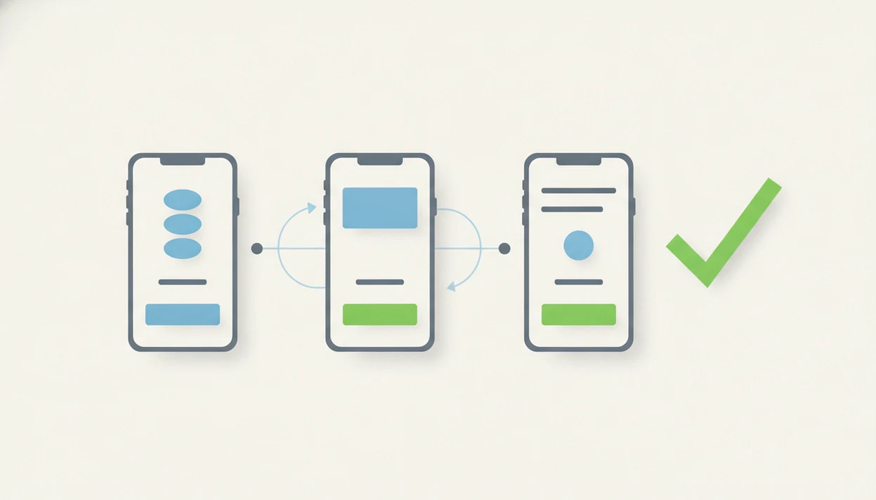
How to use app UI patterns for higher conversion
Use app UI patterns by starting with the user task, then selecting the simplest familiar structure that moves that task forward. The pattern should be instrumented, reviewed, and revised based on behavior, not taste.
Follow these six steps in order. Each step should produce a concrete artifact: a mapped task, a selected pattern, defined states, analytics events, review evidence, or a decision to keep or change the pattern.
1. Map the conversion task
- Define the user’s goal and the conversion point, such as account creation, trial start, first upload, booking, or purchase.
- Mark one primary action per screen where possible, then move secondary actions out of the main path.
2. Choose the simplest familiar pattern
- Choose a standard pattern before inventing a custom interaction, especially for navigation, forms, search, and permissions.
3. Add feedback and recovery states
- Write loading, empty, error, disabled, and success states before the build train reaches review week.
4. Log pattern-level analytics
- Track tap rate, completion rate, error frequency, and step drop-off for the specific pattern.
5. Review behavior and iterate
- Compare results with session replays, support tickets, and user interviews, then revise the pattern only where evidence points.
A practical product and ux workflow treats pattern selection as part of the release system, not a late visual polish pass.
Conversion-focused app UI pattern examples
Conversion-focused UI patterns work when each one has a clear job, a visible primary action, and accessible labels. The same pattern can help or hurt depending on timing and user intent.
| Pattern family | Best for | Conversion role | Common risk |
|---|---|---|---|
| Bottom navigation | Top-level destinations | Keeps main tasks visible | Too many tabs dilute priority |
| Cards | Browsing content or products | Makes choices scannable | Weak hierarchy turns cards into clutter |
| Onboarding checklists | Activation steps | Shows progress toward value | Can feel like homework |
| Short forms | Sign-up, checkout, requests | Reduces input effort | Missing context can lower trust |
| Bottom sheets | Focused choices | Keeps users in flow | Overuse hides important actions |
| Empty states | First-run screens | Points users to the next step | Cute copy without action wastes space |
| Permission prompts | Camera, location, notifications | Enables core features | Early prompts can feel invasive |
| Error messages | Recovery | Prevents abandonment | Vague blame language frustrates users |
Baymard Institute’s checkout UX research documents that form-field friction, unclear validation, and avoidable inputs are recurring causes of abandonment, especially in checkout and sign-up flows (Baymard). The safer reading is simple: input patterns deserve measurement, not guesswork. For teams refining sign-up, the mobile app onboarding flow is usually the right place to start.
Navigation UI patterns for mobile app task success
Navigation patterns affect whether users can find the value you already built. Primary destinations should be visible; secondary destinations can live in menus, settings, or search.
Tab bars and bottom navigation work well for three to five persistent destinations. Search helps when users know what they want. Hamburger menus and drawers can hold lower-frequency areas, but they often hide discovery paths. Nested menus fit complex products only when labels are plain and depth is controlled.
One map is enough.
Trouble starts when an app uses a tab bar, hamburger menu, floating action button, bottom sheet, and nested account menu at the same time. Users stop reading hierarchy and start hunting. Nielsen Norman Group has repeatedly warned that hidden navigation, including overreliance on hamburger menus, can reduce discoverability and slow task completion (Nielsen Norman Group). That does not make one layout universal, but it shows why navigation choices deserve product-level review.
Onboarding and form UI patterns that reduce drop-off
Onboarding and form patterns reduce drop-off when they ask for less, explain more, and recover gracefully from mistakes. The first run should help users reach value before the app asks for trust-heavy permissions.
Progressive onboarding works better than a long tour when the user can learn inside the task. Checklists help when activation has several concrete steps. Single sign-on reduces typing. Fewer required fields, clear labels, inline validation, and forgiving error recovery can reduce abandonment without changing the core product.
Permission timing matters. Ask for location, contacts, camera, or notifications after the user sees why the access is needed. A premature prompt feels like a policy update email flagged before coffee: important, but badly timed. For messaging flows, connect the prompt to a real push notification strategy, not a generic retention wish.
Confusing first-run screens can also create negative reviews, which may affect app store discovery. The cramped release note field will not save a broken onboarding path.
Common app UI pattern mistakes that hurt conversion
Common app UI pattern mistakes hurt conversion by hiding actions, increasing effort, or breaking trust at the exact moment users need confidence. Popular patterns do not automatically fit every audience or product category.
- Icon-only controls. Icons without text labels force interpretation, and accessibility tools may expose weak or missing names.
- Hidden gestures. Swipe-only actions are easy to miss, especially for new users and older audiences.
- Excessive carousels. Important content can disappear behind swiping, which lowers discoverability on small screens.
- Long forms and unclear CTAs. Every extra field and vague button label adds a reason to pause.
- Vague error states. “Something went wrong” does not tell users how to recover.
- Overloaded navigation. Competing menus make the product feel larger than the user’s task.
Accessibility failures compound these mistakes. Low contrast, tiny tap targets, and missing labels can block task completion entirely. A focused app accessibility review should happen before pattern changes reach store review.
Tools like Power Themes are useful when they separate what the store requires from what marketers recommend, especially around metadata, reviews, and release operations.
Limitations
App UI patterns can improve conversion, but they are not guaranteed fixes. Treat them as structured hypotheses that still need user research, usability testing, and product judgment.
- A pattern that works in a social app may fail in fintech, healthcare, B2B, or high-risk workflows.
- Pattern libraries can lag behind platform changes in iOS, Android, and web frameworks.
- Common best practices may underrepresent non-Western, low-bandwidth, older, or accessibility-first audiences.
- Trendy gestures and icon-only controls can hurt learnability and accessibility.
- It is difficult to isolate one pattern’s impact when pricing, copy, performance, traffic source, and release timing change together.
- A clean pattern cannot repair a weak value proposition or unclear business model.
- Analytics can show where users drop, but interviews and support logs explain why.
Power Themes covers these tradeoffs as part of broader mobile product and growth operations. Pattern decisions should be compared with user feedback loops in mobile apps, not only dashboard movement.
FAQ
What are app UI patterns?
App UI patterns are reusable layout and interaction solutions used to solve common interface problems in mobile and software products. Examples include tab bars, forms, cards, bottom sheets, onboarding flows, and error states.
Why do app UI patterns matter for users?
App UI patterns reduce learning effort because users recognize familiar layouts and behaviors. They improve predictability and can help people complete tasks faster.
Which app UI patterns can improve conversion?
Clear calls to action, short forms, guided onboarding, visible navigation, helpful empty states, and specific error messages can improve conversion. Their impact depends on the user goal and product context.
Are app UI patterns the same as templates?
No. Patterns include behavior, states, timing, and interaction logic, while templates are usually static screen layouts.
How do product teams choose the right app UI pattern?
Product teams should choose patterns based on user goals, platform conventions, accessibility needs, and measurable outcomes. Power Themes recommends comparing the policy text against the workflow before changing store-facing flows.
Do carousels hurt app conversion?
Carousels can hurt conversion when they hide important content or require extra swiping to find key actions. They work better for optional browsing than for essential instructions.
How should apps measure whether a UI pattern is working?
Apps should track tap rate, completion rate, step drop-off, form errors, time to task, retention, and qualitative feedback. Power Themes treats those measures as pattern-level evidence, not final proof.
Can app UI patterns hurt accessibility?
Yes. Gesture-only navigation, icon-only buttons, low contrast, small tap targets, and missing labels can make patterns harder or impossible to use.